CSS Centering Made Easy (2025 Edition)

In Web Development centering an element was always a challenging task. Whether it's a simple block, a paragraph or a complex layout. Aligning them in a center use to a tricky task. With the help of modern CSS technique centering elements has now become much easier and efficient.
When we are discussing in the year 2025, the CSS tools like Flexbox or CSS Grid has completely revolutionize the web development. Now centering the elements has been straightforward and efficient.
In this blog article we will discuss how you can center any element from simple text to complex blocks using modern methods of CSS.
Centering with text-align for Inline Elements
Flexbox: Easy Centering for Modern Layouts
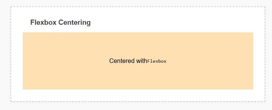
display: flex;This makes the parent container a flex container.justify-content: center;It Centers the content horizontally.align-items: center;Centers the content vertically.height: 100vh;Ensures that the flex container takes up full viewport height, making vertical centering easily achieved.CSS Grid: Centering for Complex Layouts
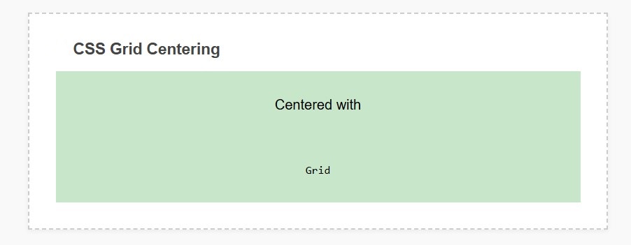
display: grid;This makes the container a grid container.place-items: center;is shorthand for centering the content on both horizontal and vertical axes.height: 100vh;gives the grid container the full viewport height.Margin Auto: Center Fixed-Width Elements
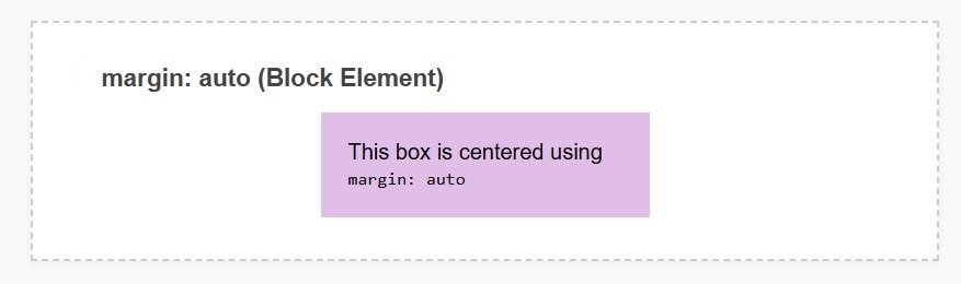
margin: 0 auto;centers the block-level element horizontally within the parent container.This method is best when you know the element's fixed width and want to center it without using any complex layout tools.
Absolute Positioning: Center Known-Size Elements
margin: 0 auto;places the element at a relative position to its nearest positioned ancestor.top: 50%; left: 50%;is used to move the element from the top-left corner to the center.transform: translate(-50%, -50%);brings the element exactly to the center by adjusting half of its width and height.Transform: Quick Centering
This method is similar to the previous method, just a slightly shorter version using absolute positioning, where the center is achieved through transform.
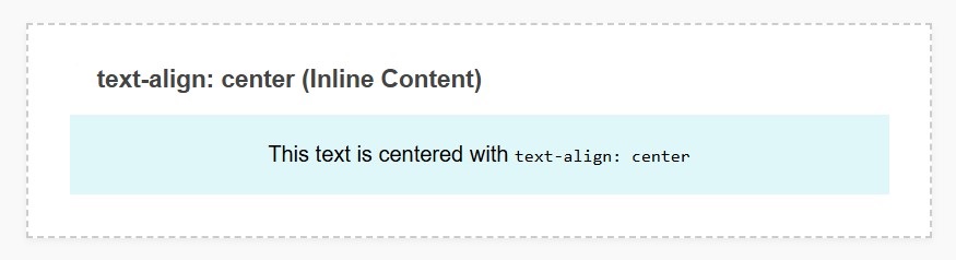
Let's first proceed with the old school method. This approach is helpful for the inline elements like text or images that are within a block-level element.
We can easily center the content horizontally by simply applying text-align: center;
Code Example:
html
This text is centered using the old-fashioned way!
css
.center-text {
  text-align: center;
}
Explanation:
The text-align: center; property centers the inline content horizontally within the block container. This method is simple, but is only effective for inline or inline-block elements.
Now its time for flexbox, this is a flexible layout model that allows you to center elements horizontally or vertically. Flexbox is perfect for modern web applications and layouts where you need to center the content without any tension.
We can easily center the content horizontally by simply applying text-align: center;
Code Example:
html
      Centered with Flexbox!
	  This content is centered both horizontally and vertically using Flexbox.
css
.flex-container {
  display: flex;
  justify-content: center; /* Centers horizontally */
  align-items: center; /* Centers vertically */
  height: 100vh; /* Full viewport height */
}

.flex-item {
  padding: 20px;
  border: 1px solid #ccc;
}
Explanation:
If you want to create complex layouts where you want control over your rows or columns then using CSS Grids for centering is considered as the best way.
This method is most useful when you need to center elements in grid based layouts.
We can easily center the content horizontally by simply applying text-align: center;
Code Example:
html
      Centered with CSS Grid!
	  This element is perfectly centered using CSS Grid.
css
.grid-container {
  display: grid;
  place-items: center; /* Shorthand for centering both vertically and horizontally */
  height: 100vh;
}

.grid-item {
  padding: 20px;
  border: 1px solid #ccc;
}
Explanation:
When you are working with fixed width element then margin:0 auto; method is still useful. This technique is a simple and effective method to horizontally center block-level elements.
Code Example:
html
This box is centered using margin auto.
css
.center-box {
  width: 300px;
  margin: 0 auto; /* Centers horizontally */
  padding: 20px;
  border: 1px solid #ccc;
}
Explanation:
When you are working with modals, popup or elements that you've already defined the size of, perfect centering can be achieved by using absolute positioning.
Code Example:
html
      Centered with Absolute Positioning
      This modal is centered using absolute positioning and transform.
css
.absolute-center {
  position: absolute;
  top: 50%;
  left: 50%;
  transform: translate(-50%, -50%);
  padding: 20px;
  border: 1px solid #ccc;
}
Explanation:
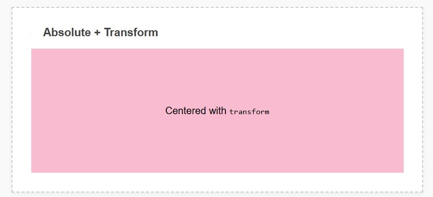
If you need a quick and simple method to center elements, you can do so easily using the transform property.
Code Example:
html
      Centered with Transform
      This is another way to center an element using transform.
css
.transform-center {
  position: absolute;
  top: 50%;
  left: 50%;
  transform: translate(-50%, -50%);
  padding: 20px;
  border: 1px solid #ccc;
}
Explanation:
Conclusion
Today, centering elements in modern web design has become much simpler, powerful, and flexible thanks to Flexbox and CSS Grid. Whether you're creating a complex layout or centering simple text, these techniques will help you center content.
CSS Grid is useful for complex layout creation.
margin: auto; is suitable for only fixed-width elements.
Position absolute is ideal for elements with definite known sizes.
Now you have certain tools along with sufficient knowledge to help center each element. Now you can design layouts that are beautiful, responsive, as well as user-friendly.


